WNG
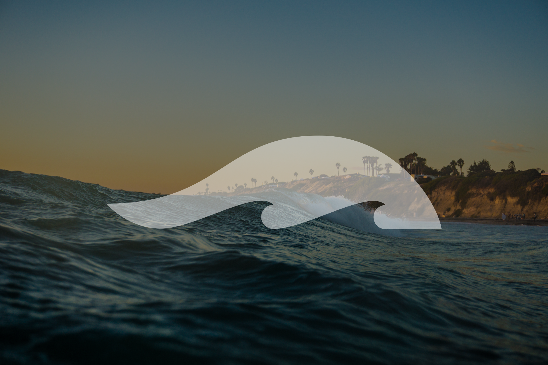
A clean, minimalistic mark for WNG, a Santa Barbara community-based surf team representing White and Grube Orthodontics. The logo mark’s foundation was established by pronouncing the WNG as “Wing”. Like surfers flying across the ocean’s waves, producing a mark with those elements seemed fitting.


